Plate 00SPP brand guidelines
The SPP roundel.
Indigo, sky and gold in one circle. Everything needed to use the SPP identity correctly — on a screen, a shirt, a van or a billboard. Partners and press are welcome to download the marks below.
Plate 01The parts of the mark
One circle, two blues, three letters.
The SPP mark is a circle divided by a wave. To the left of the seam sits deep indigo — on this site, the colour of the press room; to the right, sky blue — the open air our billboards stand in. A thin white seam separates the two.
Down that seam run the letters S, P, P in gold italic serif, stacked one above the other, and along the base, in small white capitals, the company name: SOLE CO., LTD.
The mark on this site was redrawn as vector from SPP’s printed collateral, so it stays sharp at any size — on screen, in vinyl, in thread — and every file below shares one set of curves.
Plate 02Logo versions
Three files. That is the whole kit.
Vector SVG — scale them to any size. Full colour wherever the process allows; the one-colour versions are for single-thread, single-screen and engraved work.
01
Full colour
The primary version: indigo, sky and gold with white knock-outs. Because the colour lives inside the circle, the same file works on midnight indigo and on white — no outline, no plate behind it.
Download SVG · spp-logo.svg02
One colour — indigo
Indigo disc, the seam and letters knocked out to the ground. Embroidery, engraving, vinyl cut and single-colour screen print on light grounds.
Download SVG · spp-logo-mono-ink.svg03
One colour — white
White disc, the seam and letters knocked out in indigo. For dark grounds in one-colour processes, watermarks and reverse printing.
Download SVG · spp-logo-mono-white.svg
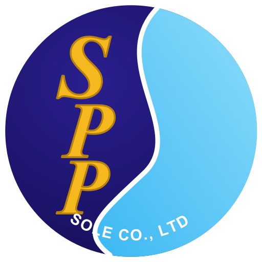
Plate 03Clear space & minimum size
Give it room.
Keep a margin of x on every side, where x is the height of the “S” — about a quarter of the roundel’s diameter. Nothing enters that space: no text, no edge, no other logo.
Minimum size
Roundel
Screen 24 px
Print 10 mm
Lockup
Screen 20 px high
Print 8 mm high
Below these sizes the base text “SOLE CO., LTD” is dropped and the roundel carries the letters alone. For embroidery, keep the roundel at least 30 mm across so the base text stitches — or drop it.
Plate 04Incorrect use
Eight ways to break it.
The roundel is one piece: circle, seam, letters, base text. Change any part and it stops being ours. If a situation is not covered here, ask us — we would rather redraw an application than see the mark bent to fit one.
Don’t stretch or condense it.
Don’t rotate it — the seam runs top to bottom.
Don’t recolour it — indigo, sky, gold and white only.
Don’t move the letters off the seam.
Don’t outline it or invert the seam.
Don’t place it on a ground without contrast.
Don’t add shadows, glows or effects.
Don’t crowd it — respect the clear space.
Plate 05Colour
Gold, sky and the deep blue of midnight.
SPP’s colours are gold, light blue, a deep blue that leans to purple, and a little white. Indigo carries the page, gold makes the point, sky informs. Process cyan and magenta survive only as printer’s details.
ink-950
Midnight Indigo
The ground. SPP’s deep blue taken to night — most of what we publish sits on it.
- HEX
- #08091c
- RGB
- 8 / 9 / 28
- CMYK≈
- 71 / 68 / 0 / 89
gold
SPP Gold
The signature and the second colour of the site: one gold band per page, rules, numerals, outlines, the active state, the letters in the roundel.
- HEX
- #f5b81f
- RGB
- 245 / 184 / 31
- CMYK≈
- 0 / 25 / 87 / 4
sky
Sky
The secondary accent. Links, information, data series, construction lines.
- HEX
- #38b6f2
- RGB
- 56 / 182 / 242
- CMYK≈
- 77 / 25 / 0 / 5
navy
SPP Navy
The heritage deep blue. Garments, vehicle livery, large printed solids.
- HEX
- #1a1a8c
- RGB
- 26 / 26 / 140
- CMYK≈
- 81 / 81 / 0 / 45
ultra
Ultra
Links and focus rings on white.
- HEX
- #2326a8
- RGB
- 35 / 38 / 168
- CMYK≈
- 79 / 77 / 0 / 34
violet
Violet
The purple edge of the blue. Atmosphere and depth — never text on indigo.
- HEX
- #4b3fd1
- RGB
- 75 / 63 / 209
- CMYK≈
- 64 / 70 / 0 / 18
Cool White
“A bit of white”: inverse sections, long reading, text on indigo.
- HEX
- #f5f7fd
- RGB
- 245 / 247 / 253
- CMYK≈
- 3 / 2 / 0 / 1
Indigo Raised
Panels and raised surfaces; text on white.
- HEX
- #0d0f2a
- RGB
- 13 / 15 / 42
- CMYK≈
- 69 / 64 / 0 / 84
Indigo Line
Hairline rules on indigo.
- HEX
- #232655
- RGB
- 35 / 38 / 85
- CMYK≈
- 59 / 55 / 0 / 67
Fog
Labels and secondary text on indigo.
- HEX
- #9ca3c6
- RGB
- 156 / 163 / 198
- CMYK≈
- 21 / 18 / 0 / 22
Usage ratio
Gold works because there is so little of it, and sky works because there is even less. If a layout feels flat, add contrast in scale or tone before adding more colour.
- Midnight Indigo 50%
- Gold 20%
- Cool White 16%
- Deep blues 9%
- Sky 5%
Accessible pairings
Contrast ratios are calculated from the values above (WCAG 2). Body text needs 4.5:1 (AA); large display type and interface graphics need 3:1.
- Aa18.4:1
AAA
Cool White on Midnight Indigo
Headlines and body
- Aa11.0:1
AAA
Gold on Midnight Indigo
The highlighted word, active states
- Aa8.6:1
AAA
Sky on Midnight Indigo
Links, information
- Aa7.9:1
AAA
Fog on Midnight Indigo
Labels, meta
- Aa11.0:1
AAA
Midnight Indigo on Gold
Primary buttons, the closing band
- Aa17.5:1
AAA
Indigo on Cool White
Text on white
- Aa10.2:1
AAA
Ultra on Cool White
Links on white
- Aa12.5:1
AAA
Cool White on SPP Navy
Garments, livery
- Aa1.7:1
Fails
Gold on Cool White
Never for text — use gold as a fill behind indigo
- Aa2.1:1
Fails
Sky on Cool White
Never for text — use Ultra
- Aa1.7:1
Fails
Cool White on Gold
Never — text on gold is always indigo
- Aa2.7:1
Fails
Violet on Midnight Indigo
Never for text — atmosphere only
Do
- Let midnight indigo carry the layout; colour arrives as an event.
- One gold action per view. If two things are gold, neither is primary.
- Use sky for what informs — links, data, guides — and gold for what converts.
- Set text on gold in midnight indigo, always.
- Bring in cool white for long reading and a change of pace.
Don’t
- Don’t use pure black or pure white. Our dark is indigo; our white is cool.
- Don’t give gold and sky equal weight — sky is always the quieter of the two.
- Don’t set gold or sky text on white; both fail contrast.
- Don’t turn gold into a gradient, a glow or a metallic effect.
- Don’t use orange as a brand colour — it is reserved for warnings.
CMYK values are arithmetic approximations for orientation only. Deep blues and violets shift noticeably between screen and press, and gold depends on the substrate — SPP prepress sets the final build for each process and confirms it on a production proof.
Plate 06Typography
Four faces, four jobs.
All four are open-licence typefaces, self-hosted with the site. Each has one role and keeps to it.
01 — Display
Bricolage Grotesque
- Headlines, titles, oversized numerals
- Weight 600–800 · width 80–88%
- Tracking −1.5% to −4.5% · leading 0.86–1.15
- Sentence case or uppercase — never title case
02 — Feeling
Instrument Serif Italic
- ONE feeling-word inside a headline
- Always italic, always lowercase
- Never for body text, labels or buttons
- Often the only gold word on the page
03 — Body
Geist
- Paragraphs, descriptions, form text
- 16 px minimum on public pages
- Leading 1.5–1.75 · measure ≤ 68 characters
- Regular for text, 600 for emphasis
04 — Label & data
JetBrains Mono
- Eyebrows, labels, meta, buttons, plate numbers
- 11 px · uppercase · tracking +14%
- Tabular figures for prices, sizes and counts
- The voice of the job ticket
Together
Plate 03 — Example
See it before it is real.
Four faces, four jobs. The grotesque shouts, the serif feels, the sans explains and the mono keeps the records. They never swap roles.
Open SPP Studio
Plate 07The print-ornament system
Borrowed from the press sheet.
The marks a printer leaves in the margin are our decoration. Use one or two per view — they are seasoning, not the meal. Corners are always square.
Crop marks
Frame ONE hero object per view — a mockup, a form, a cover. They mean “this is the finished piece”.
Registration target
Opens every eyebrow label and plate marker. Gold on indigo; indigo on white and on gold.
Plate number
Sections are numbered like press plates. Numbers run in order down the page and are never decorative.
Halftone
A quiet dot field at 5–10% opacity, always masked to fade out. Atmosphere, never pattern.
Colour bar
The only place process cyan and magenta appear at all. A 6 px strip at the edge of a section — once per page.
Hairline rules
1 px lines build every list and table. Depth comes from rules and tone steps — never shadows, never rounded cards.
Plate 08Tone of voice
Plain, specific, honest.
We write the way a good production manager talks: short sentences, real numbers, no superlatives. British spelling — colour, visualise, customise.
Calls to action
Buttons are verbs in the customer’s voice, set in mono capitals. They say exactly what happens next — no “Submit”, no “Learn more”.
- Start a project
- Design something
- Open SPP Studio
- Customise this
- Build my project
- Request a quote
- Get an estimate
- Explore billboards
- Request this location
- Let’s talk
- Upload artwork
- Visualise it
- Save design
- Download mockup
- Reorder
- View case study
We say / we don’t say
SayRequest this location
NotBook now
A billboard request is not a booking until SPP confirms it.
SayGet an estimate
NotSee the price
On-site figures are a guide. The written quote is the price.
SayLooks like this page hasn’t been printed yet.
NotError 404
Even the dead ends sound like a print shop.
SaySample project
NotTrusted by leading brands
We never borrow credibility we have not earned.
SayAutomated preflight checks are advisory.
NotYour file is approved!
A person at SPP signs off every file.
Plate 09Applications
On everything we make.
Drawn mockups showing placement, scale and colour on the products SPP produces. The garments use the same geometry as SPP Studio.
- 01
T-shirt
Full-colour roundel on SPP Navy, centred in the front print area. Screen print or DTF.
- 02
Polo shirt
Full-colour roundel at left chest. Embroidery — keep it over 30 mm so the base text stitches, or drop the base text.
- 03
Cap
One-colour roundel in midnight indigo on gold; the seam and letters are the cap fabric showing through. Flat embroidery on the front panel.
- 04
Tote bag
One-colour roundel with the tagline. Single-colour screen print in midnight indigo on white canvas; the knock-outs are the canvas.
- 05
Billboard
Gold face, the full-colour roundel at the left, tagline in indigo, seven words or fewer. The roundel carries its own colour, so it needs no plate behind it.
- 06
Business card
Indigo front with the roundel alone; white back with a small roundel and details in mono. 90 × 54 mm.
- 07
Vehicle side
Full-colour roundel with the lockup text on the cargo panel, gold sill band, contact line in mono. Printed and cut vinyl.
Need a format that is not here — EPS, PDF, embroidery file? Write to spp_sole@yahoo.com.
Next step
Now put your own mark on something.
The same care goes into your brand. Try it on a shirt in SPP Studio, or ask our designers to build your identity.